TiriVelo
Admin Dashboard – Booking Flow
Designing the system behind the service

The context
The IDP is the final phase of the Springboard UI/UX Bootcamp, a one-month industry internship where students work with real companies to build job-ready portfolio pieces.
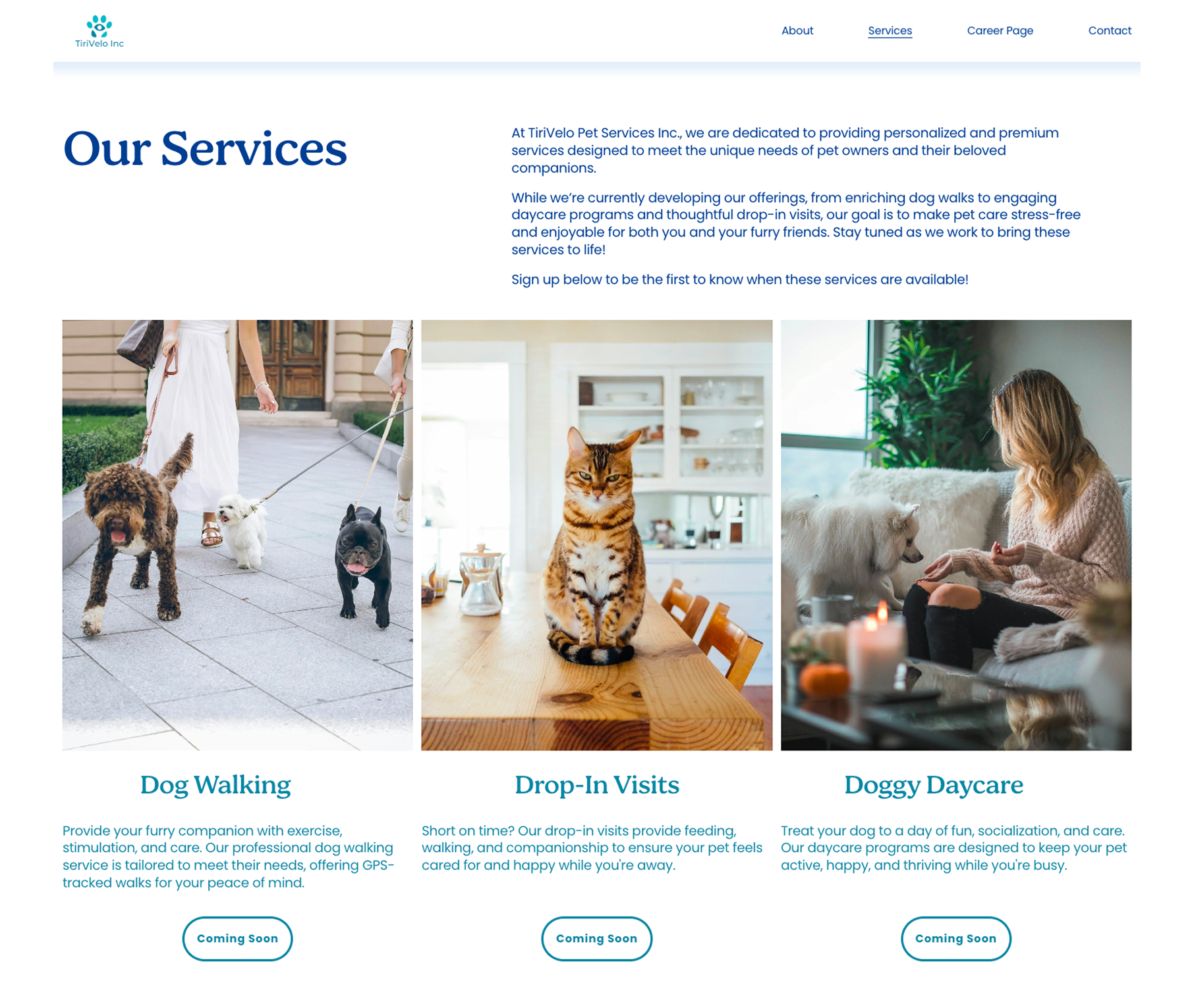
The company: TiriVelo, a Canadian startup connecting pet owners with dog walkers and pet sitters.
The assignment: design the internal admin system that keeps every booking on track.

The brief
When something happens on the platform, what does admin need to do?
My job was to design that operational layer:
- How bookings are tracked from request to payout.
- How admin monitors active, upcoming, and completed bookings.
- How issues like cancellations, no-shows or disputes get surfaced and resolved.
Focus: visibility + control.
Where I started
Understanding the platform before designing for it
Before touching Figma, I read everything:
- Platform policies and operational rules.
- Admin dashboard instructions.
- Service life cycle and operational workflows.
- Roles, permissions, and system logic.
Then I reviewed the existing designs: the Admin Dashboard Figma files, prototypes, and the website and mobile designs from other teams.
The goal was to find where the documented workflows and the existing UI aligned and where they didn't.

Making it visible
After reading all the documentation and reviewing the designs, I built a detailed workflow map of the entire booking life cycle.
This gave me:
- A visual reference for every state transition.
- Clarity on which steps required admin attention and which were automatic.
- A foundation for designing screens that matched actual system logic – not assumptions.

Building a shared language
Naming things well is a design decision. Admins have to learn these fast. The labels have to do the work at a glance.
Each lifecycle stage needed a name that was short, descriptive, and immediately readable as a colored label across the entire platform — not just bookings.

When things go wrong
The happy path is the easy part. Real operations run on edge cases. I designed screens for every state where the expected path breaks down:

An additional layer
Sometimes the state alone isn't enough. Flags sit on top of status labels to surface specific, time-sensitive issues without changing the booking's core state.

The bookings dashboard
The dashboard gives admins a clear overview and the ability to focus on what needs attention. Four filter cards:
The colored labels on Status and Flags columns make them the most visible and is where the most important information is.

The booking detail view
The same structure, different content and actions at every state.
Every booking detail page shares the same six-section layout. What changes is what's shown and what admin can do.
- Booking Summary: service type, time, location, owner, provider, pet, payment method. Right column adapts to current state.
- Timeline: chronological record of state transitions.
- Documentation: the evidence trail. GPS check-in/out, care reports, dispute records, cancellation logs. Most critical when issues need to be reconstructed.
- Contact & Intervene: messaging plus state-appropriate admin actions.
- Linked Records: owner and provider history, prior interactions between this pair. Surfaces context before admin takes action.
- Audit & Notify: admin notes and resolution log across the life cycle.

The happy path in practice
Most bookings need no admin attention at all. The system handles the transitions automatically. Admin visibility matters here, not because action is required, but because when something does go wrong, the paper trail is already there.

Disputed, the hardest state to design
Payment frozen, two parties disagreeing and a 5-business-day clock. The Disputed state is the most admin-intensive in the system. Either party can file a dispute: service quality, billing or no-show contestation.
The architecture is in place: investigation cards, three-way decision interface, SLA mechanics. The resolution modals, evidence linking, notification copy… are flagged for the next designer.
Admin must:
- Review evidence from both parties.
- Decide in favor of the owner, the provider, or split.
- Resolve within SLA or escalate to senior support.

What I handed off
All major state variants are designed, that means the full booking life cycle is covered. The next designer can focus on:
- Appeal sidebar for No-Show states: evidence review and decision interface, shared component across both variants.
- Audit & Notify: state-specific fields and required inputs, especially for Disputed and No-Show.
- Documentation tabs: Conversation Log, Care Report, and GPS Data need a deeper pass; some may be conditional by state.
- Modal designs: Contact & Intervene hold the follow-up actions, how do each one works.
- Disputed state refinement: resolution modal specifics, given the financial and potential legal stakes.

Reflection
What this project taught me about designing for operations
Designing for admin users is different from designing for consumers. The goal isn't delight — it's clarity under pressure.
Every design decision I made came back to one question: when something goes wrong and an admin needs to resolve it fast, does this screen give them what they need?
The workflow map wasn't just a deliverable. It was the thinking tool that made everything else possible.

Let's work together
I'm currently looking for full-time UI/UX design roles. If you think I'd be a good fit for your team, I'd love to hear from you.
studio@ceciliaceballos.com