SAVR:
Making Complex Recipes Easy to Follow
The problem
Savr's active community loves the app, but complex recipes are causing frustration.
- Confusing step order.
- Difficult timing coordination.
- Unknown techniques with no visual guidance.
- Missing preparation before cooking begins.
The challenge: Make cooking with the app easy and enjoyable, even for the most complicated dishes.
Method used: modified GV Design Sprint.
Day 1: Map
Long-term goal: No matter how complex or new the recipe is, Home Chefs get amazing results every time.
User Journey:
- Download the app.
- Browse recipes.
- Choose a dish.
- Check Ingredients and Kitchenware lists.
- Complete Pre-Cooking Steps (visual guidance).
- Follow Cooking Steps (visual + written format).
- Finish with confidence.
- Return to Savr regularly.

Day 2: Sketch
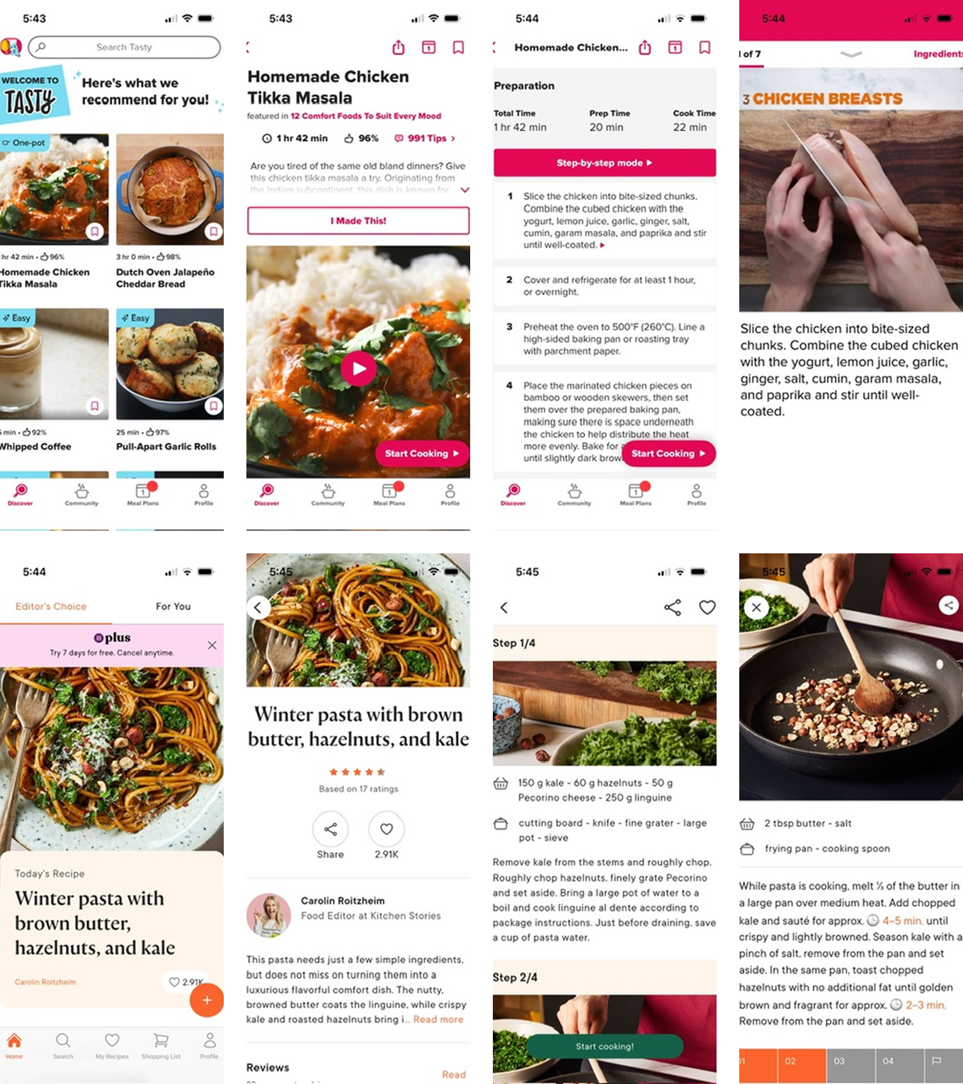
Lightning Demos
- Tasty: Video for each step + written instructions. Swipe to navigate.
- Kitchen Stories: Progress indicator showing current position. Timers appear when needed. Time divided into Preparation, Baking, and Resting.
Key insight: Users need to know what to expect before they start.
Crazy 8's
- Clickable step images with numbers.
- Three-column grid (number, text, image).
- Video on top, written steps below.
- Expandable horizontal tabs ←
- Video + text for each step (vertical scroll).
- Step bar + video player.
- Two horizontal scroll bars (pre-cooking / cooking).
- Instagram-style grid.

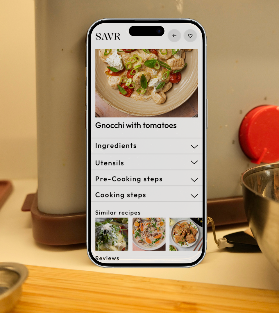
Solution Sketch
- Chosen concept: Expandable tabs.
- Sections: Ingredients | Utensils | Pre-Cooking Steps | Cooking Steps | Reviews | Similar Recipes.
Each section opens to reveal:
- Visual content (photo/video).
- Written instructions.
- Step navigation (numbered + arrows).

Day 3: Storyboard
Why Expandable Sections?
- Visibility: Users see all available information upfront — nothing gets overlooked when scrolling.
- Visual guidance: Images or video for every step helps users learn new techniques and verify progress.
- Pre-cooking section: Separates time-sensitive cooking from preparation (chop, wash, soak, preheat).


Day 4: Prototype
Built in Figma with minimal elements for honest functionality feedback.
Testing goal: Do users find expandable sections + horizontal navigation easier than traditional vertical scrolling?


Day 5: Validate
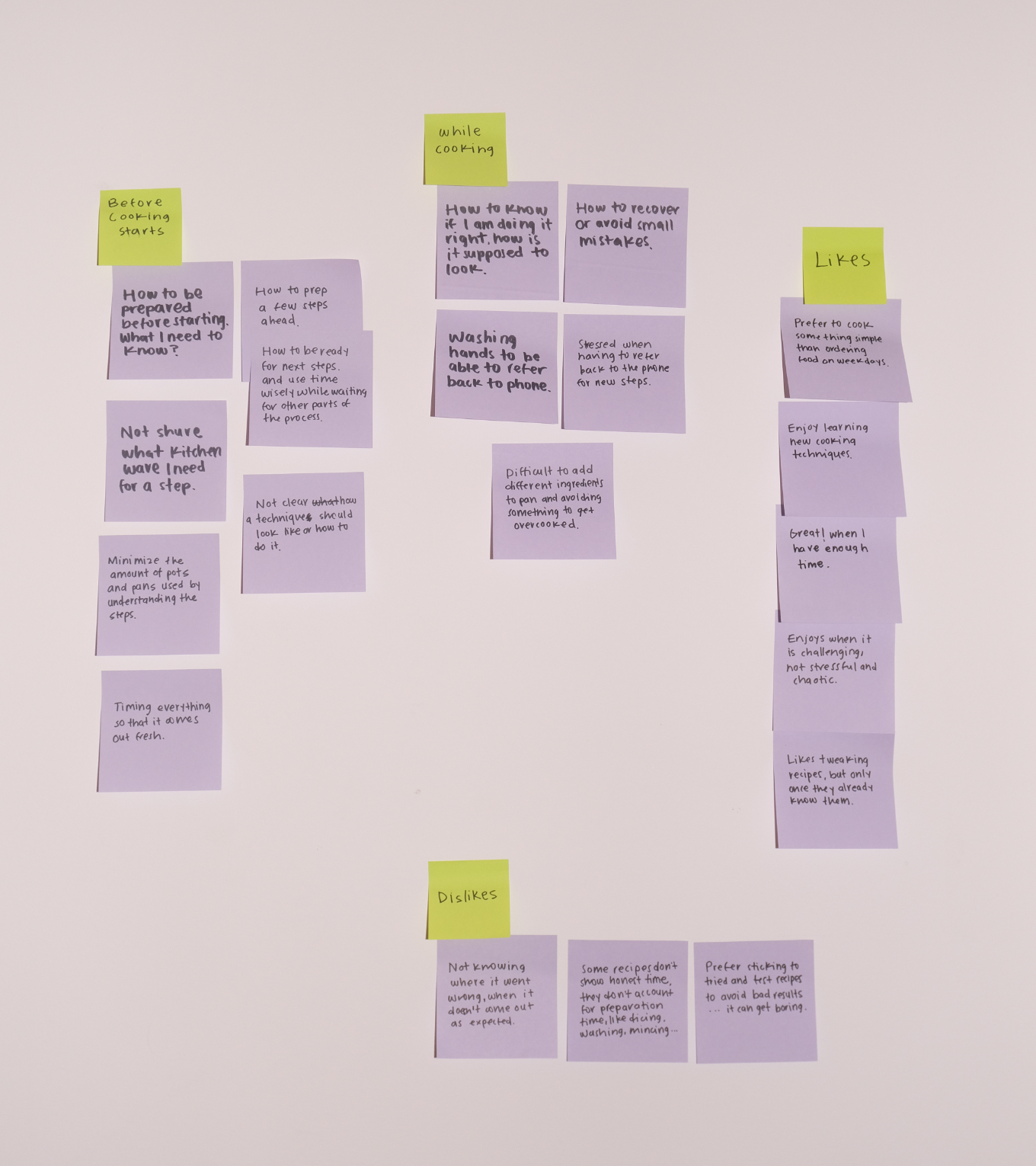
I interviewed five participants with different cooking habits and tech comfort levels:
- A 70-year-old engineer who bakes sourdough weekly.
- A 71-year-old daily cook who learns from YouTube.
- A 42-year-old IT specialist who meal preps on weekdays.
- A 40-year-old mom constantly finding new recipes for her kids.
- A 37-year-old musician who cooks to relax on weekends.

Key Findings
- ✓ Expandable sections work — Users understood them after initial scroll attempt. Being "forced" to read sections helped them find all necessary info.
- ✓ Pre-Cooking section valued — Users appreciated this addition not found in most apps.
- ⚠ Navigation preference: Users tapped step numbers instead of arrows — consider adding both options or reevaluate conflicting navigation patterns (expand/collapse + swipe).
- ⚠ Timer visibility issue: No participant noticed the timer until prompted. Needs more prominent design.

Next Steps
- Make timer more visible (icon, color, size).
- Add number navigation alongside arrows before considering change navigation pattern.
- Improve navigation flows.
- Test with users while actually cooking.
- Iterate on visual hierarchy.


Let's work together
I'm currently looking for full-time UI/UX design roles. If you think I'd be a good fit for your team, I'd love to hear from you.
studio@ceciliaceballos.com