DRAW:
Helping people who keep giving up on drawing
The cycle everyone knows
You download a tutorial app.
Watch a few videos.
Try to follow along.
Your sketch looks nothing like the instructor's.
You check Instagram, see flawless illustrations, and think:
I'll never get there.
A week passes. You haven't touched your sketchbook.
This cycle repeats for millions of aspiring artists, I designed Draw to break it.
What I set out to learn
Before designing anything, I needed to understand why this cycle keeps happening.
The research
- Secondary research on habit formation and creative skill development.
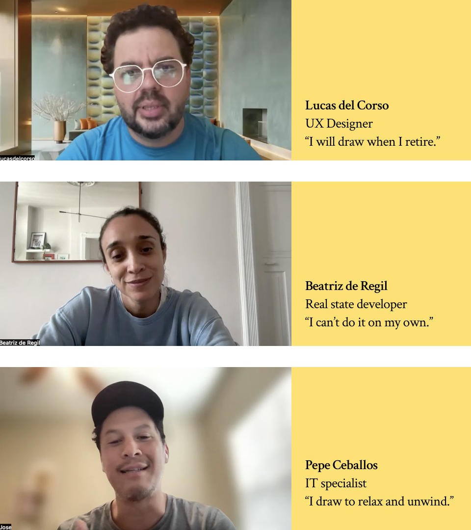
- 5 in-depth interviews with people trying to improve their drawing skills.
- Affinity mapping to find patterns across all the data.
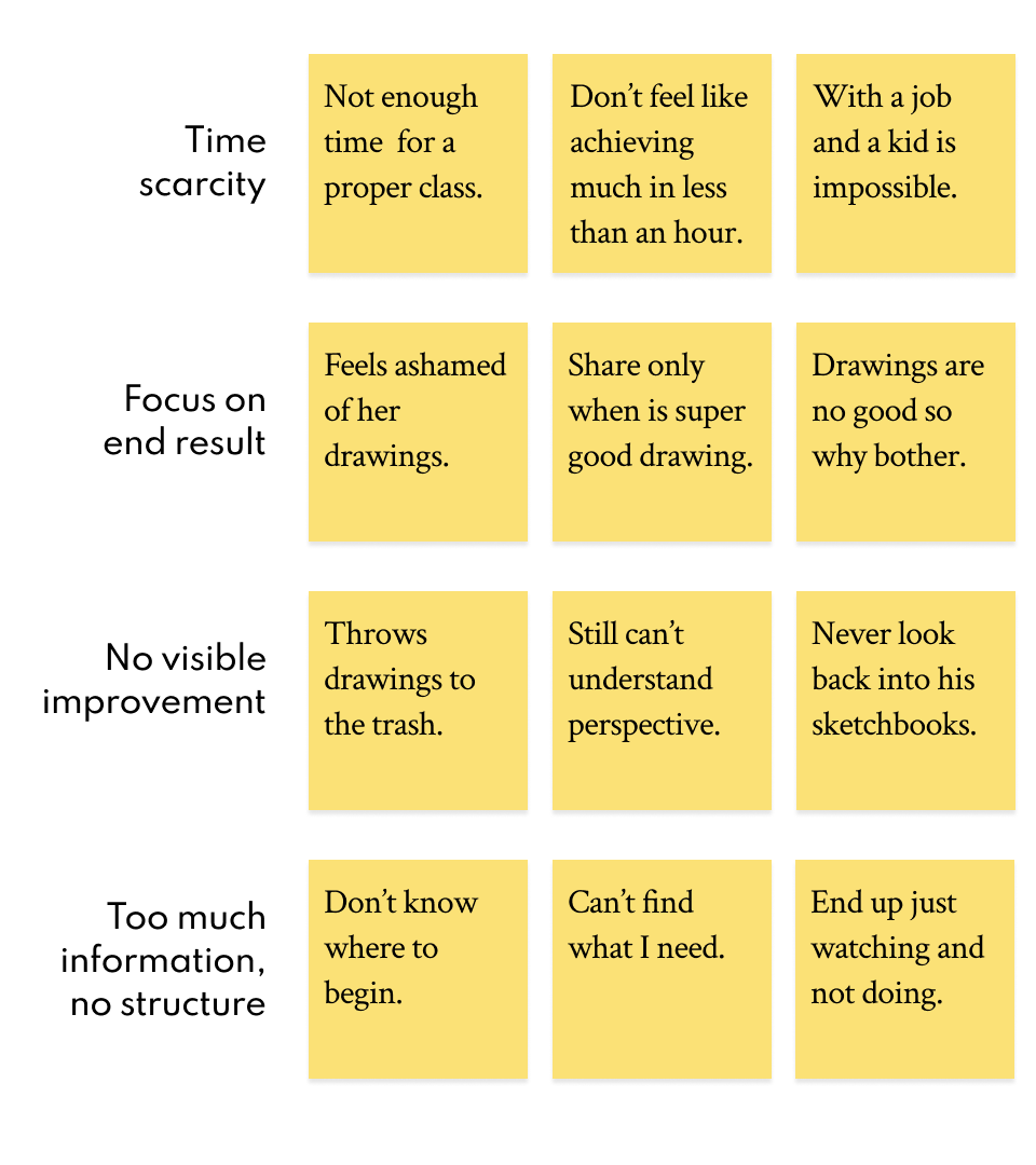
What the research revealed
The real barriers aren't what you'd expect. People don't fail because they lack talent or tutorials.
They fail because:
- They believe improvement requires hours they don't have.
- They measure success by the wrong metric. Every practice session gets judged by the final drawing. Bad result = motivation gone.
- They have no way to see their own progress. Without visible improvement, consistency feels pointless.
- Online content helps and hurts; endless tutorials create overwhelm, polished social media art creates impossible standards.
Two people, one problem
From the research, two distinct users emerged:
Antonella, the aspiring professional
Graphic designer in New York. Dreams of freelance illustration. Follows artists on Instagram and feels miles behind. Believes she needs hours of practice to catch up. Draws every other week, frustrated each time.
Nick, the screen-fatigued explorer
Marketing professional, fully remote. Spends evenings scrolling. Remembers loving to draw as a kid. Wants an analog hobby but doesn't know where to start. Lower pressure, but still compares himself to what he sees online.
Different motivations. Same pain points.
Reframing the problem
The interviews made something clear: users don't just want to "learn to draw." They want to:
- Live more creative lives.
- Feel like they're growing.
- Have a richer analog life.
The questions I needed to answer
- How might we show people that short, consistent practice beats long, sporadic sessions?
- How might we shift focus from end results to the act of practicing?
- How might we make progress visible without enabling comparison?
- How might we give structure without removing the joy?
Designing the solution
Four core tasks for the MVP
- Create a personalized routine: adapting to time, interests, and skill level.
- Stay accountable: tracking consistency, not perfection.
- Get guidance: structured practices, not endless browsing.
- See progress: comparing to yourself, not others.
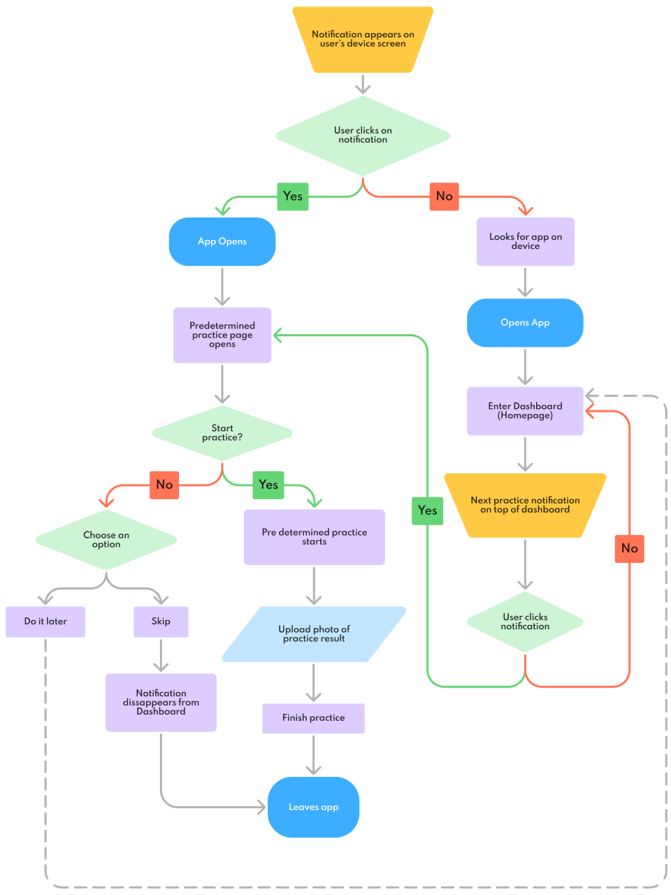
From flows to screens
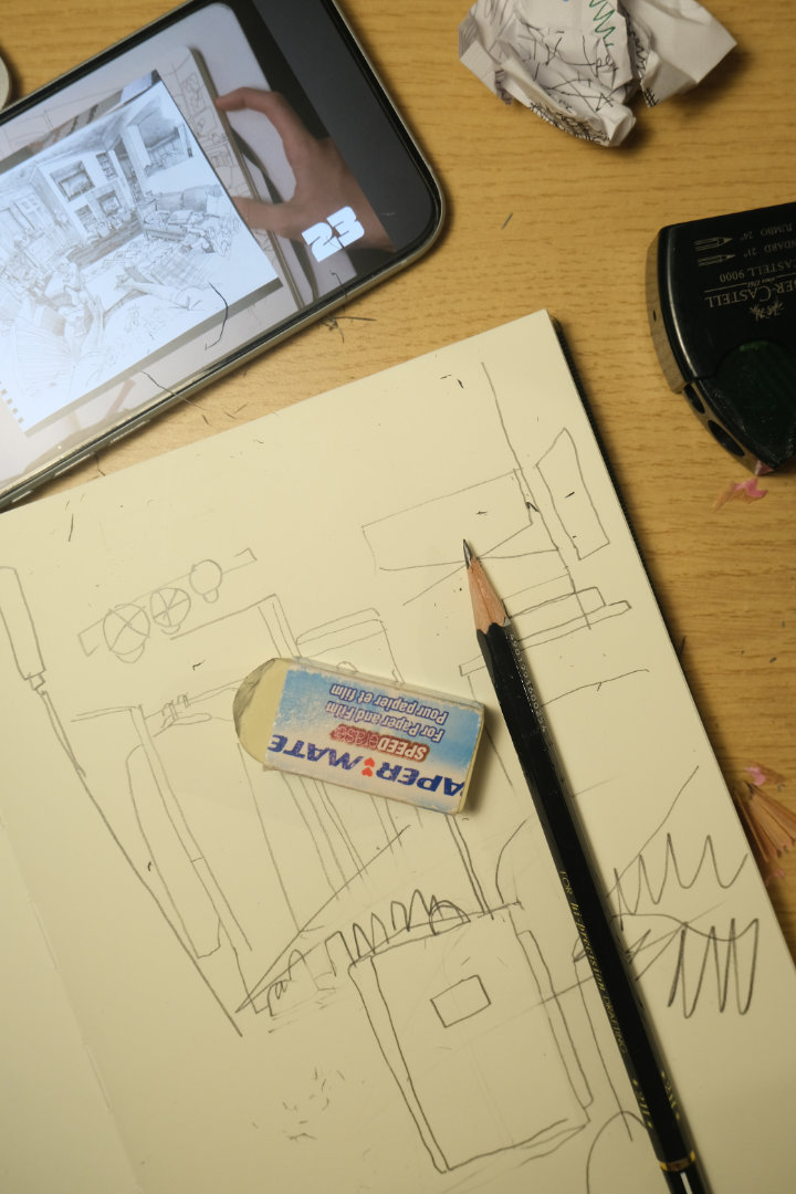
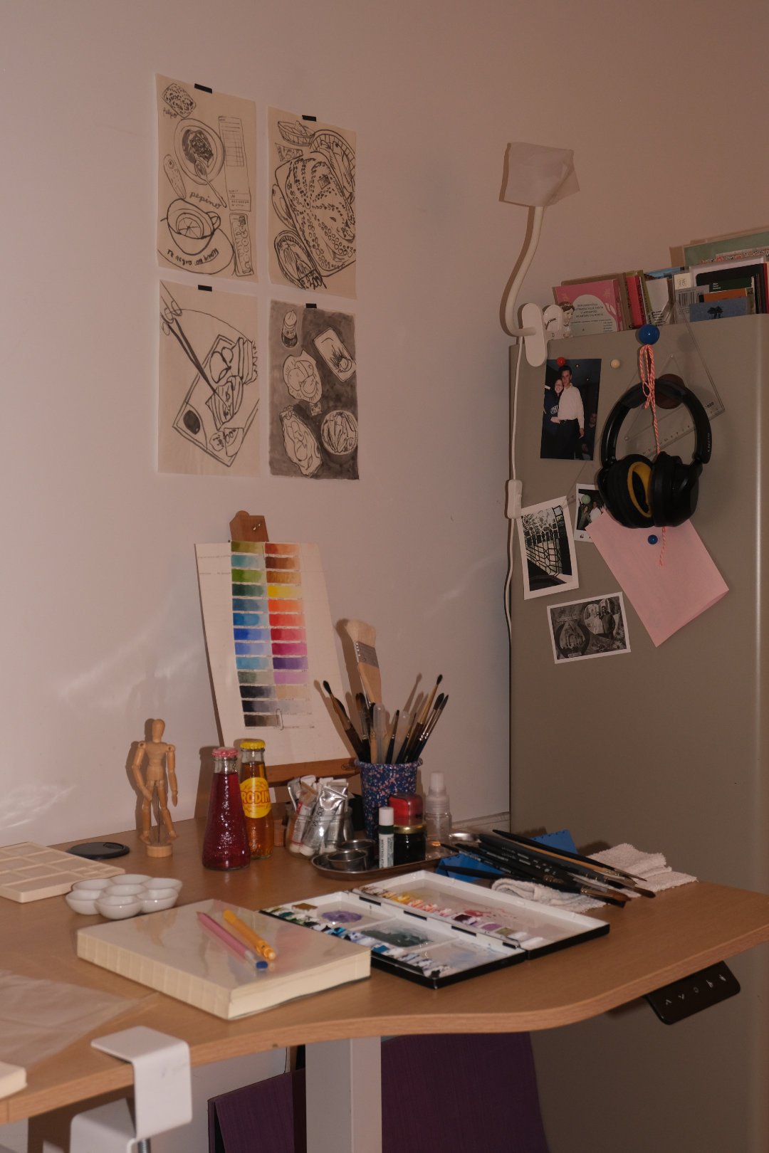
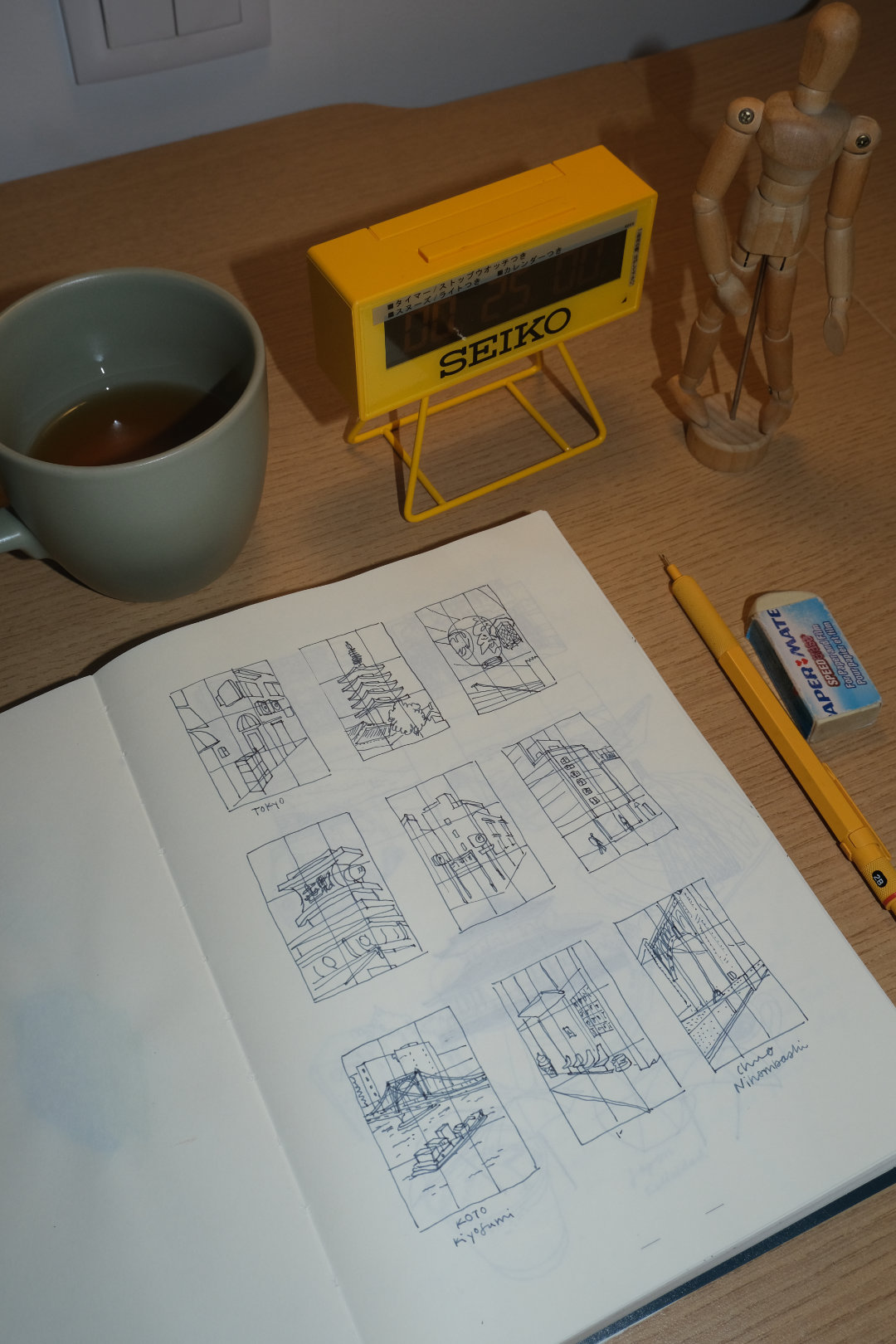
I started with user flows, then sketched on paper, then moved to digital wireframes. Each round stripped away anything that didn't directly help the user succeed.
The test I applied to every element: Does this help them practice, or distract from it?


Giving Draw a personality
The visual identity needed to say: Relax. This is play, not pressure.
- Logo: A pencil doodle that forms the word "Draw".
- Colors: Vibrant and unexpected, creativity should feel energising.
- Shapes: Round, soft, approachable.
- Illustrations: Hand-drawn marks that celebrate imperfection.
The goal was to make users feel free to experiment. No judgment. No comparison. Just practice.

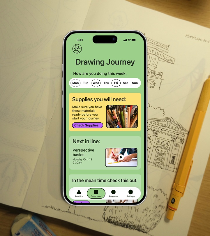
The final product
High-fidelity screens for all four core flows, built into working prototypes.
- Routine creation: personalised to time available and interests.
- Daily practice: guided sessions with clear start/end.
- Practice library: curated, not overwhelming.
- Progress tracking: consistency and personal growth.


Testing with real users
What I learned (Round 1)
- Users expected routine settings in Settings: moved routine controls there, and eliminated Routine from tab bar.
- App Tour on Onboarding felt confusing: streamlined the tour.
- Unclear what materials were needed: added a notification before their first ever practice.
- Play button got lost visually: made it more prominent.
Validating the fixes (Round 2)
Retested to confirm the changes resolved the friction.


What I learned
- Research changes the problem. I started thinking users needed better content but they needed structure.
- Personas are decision tools. Antonella and Nick helped me balance depth and approachability.
- Subtraction is design work. Removing features that enable comparison was as important as building features that support practice.
Next steps I'd explore
- Explore social features that encourage without enabling comparison.
- Design streak recovery to reduce pressure.
- Alternative ways to visualize progress.

Let's work together
I'm currently looking for full-time UI/UX design roles. If you think I'd be a good fit for your team, I'd love to hear from you.
studio@ceciliaceballos.com