CULTR:
Designing a Subscription Experience for Gen Z
The Challenge
CULTR is a fictional fashion and culture media company targeting Gen Z (Capstone 3 project). The brief: introduce a premium subscription tier without alienating the existing free user base.
Goal: Design an onboarding and subscription experience that converts free users into paying subscribers naturally — without pressure or distrust.

Understanding the Landscape
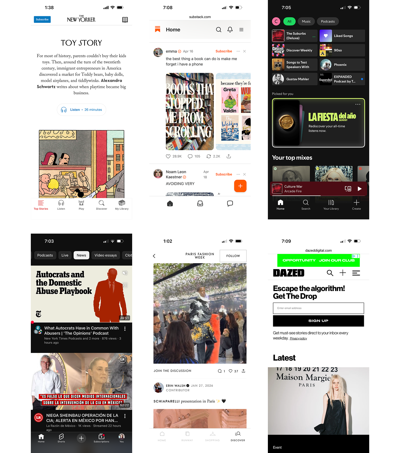
I researched 6 platforms to understand what converts users — and what pushes them away:
- Spotify: Reducing mobile friction + student pricing drove 40% conversion.
- The New Yorker: Metered paywall + identity appeal ("I'm the kind of person who reads this").
- YouTube: Premium feels like relief from friction, not a reward.
- Substack: Users pay out of loyalty to a voice, not a brand.
- i-D / Dazed: Strong cultural credibility, but no subscription revenue model to show for it.
The Design Priorities
- Social-first onboarding: Let users feel the culture before asking them to commit.
- Keep free tier valuable: Premium should feel like a natural upgrade, not a gate.
- Sell identity, not features: "Be the person who supports independent culture."
- Lower the barrier to first payment: A $1 trial removes the risk.

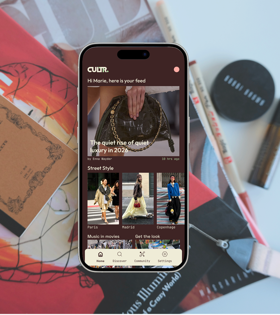
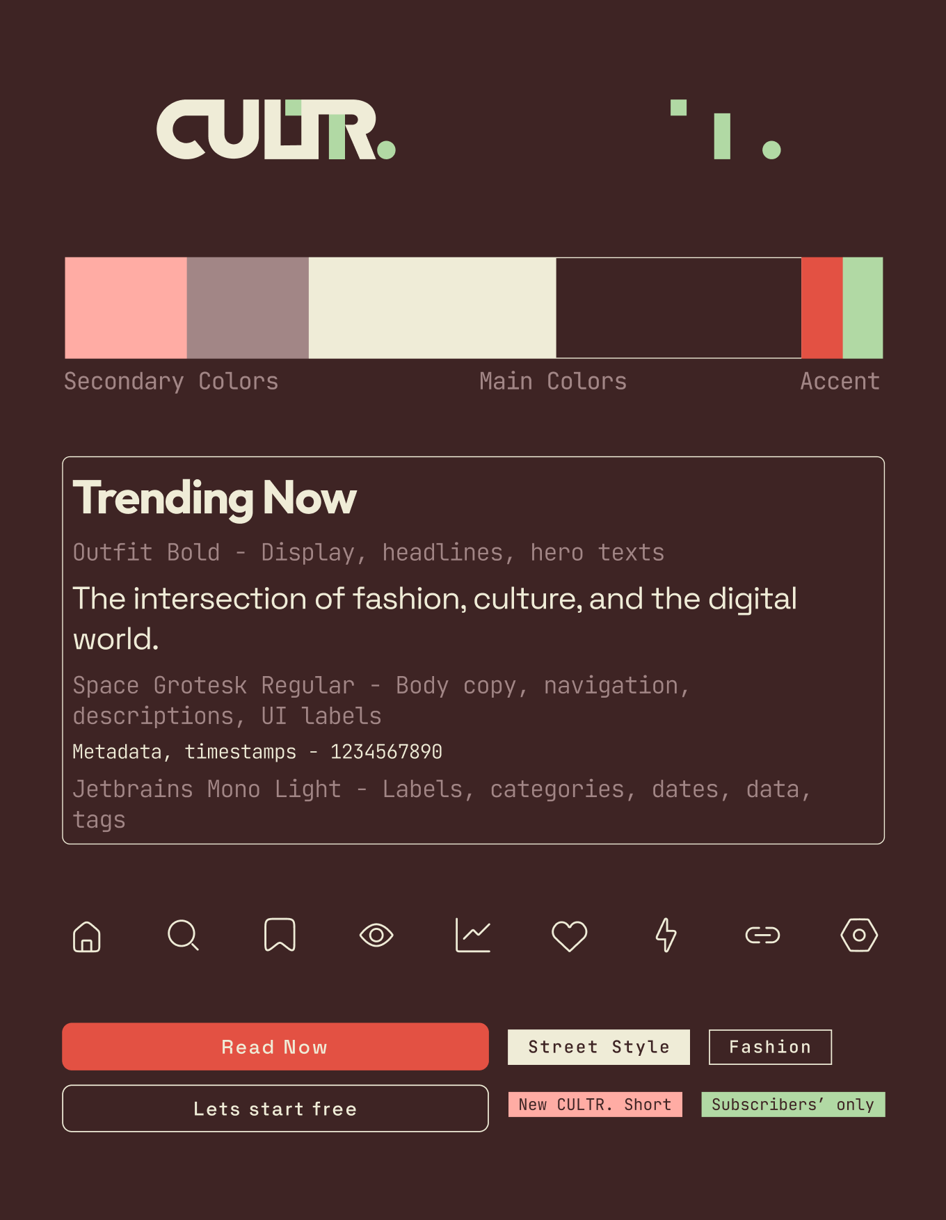
The Visual Identity
The logo connects the letters into a wordmark and icon — immediately recognisable at any size.
The colour palette is restrained, letting imagery take the lead. Typography and iconography are simple and clear, keeping the focus on the content.
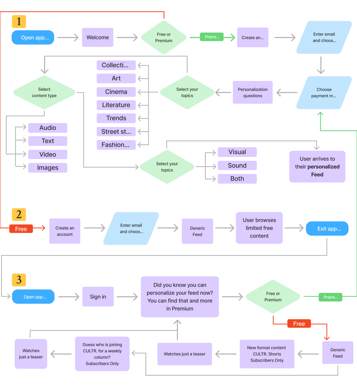
The Solution
Three user scenarios drove the flow architecture:
- New user who upgrades to premium immediately.
- New user who explores the free tier first.
- Returning free user who encounters a premium offer organically.
What Testing Revealed
Round 1 — Wireframes
Flows were clear and easy to navigate. But users wanted more: free content to explore before committing, and previews of what premium actually looks like.
Key insight: trials and sneak peeks aren't workarounds — they're conversion tools.

What Testing Revealed
Round 2 — High-Fidelity
Realistic visuals changed everything. Asking users to pay before experiencing the product creates distrust. The flow that showed pricing immediately was the least well-received.
Product-first flows performed significantly better.
The Iterations
Problem 1: Being asked to pay for something you've never used feels off.
Fix: Introduce premium after a while in the feed, via a soft pop-up modal — not as an opening screen.

Problem 2: A text-heavy screen didn't inspire users to pay.
Fix: Take users straight to the real feed and let naturally placed paywall banners make the case for premium.

Problem 3: The free sign-up flow felt too long before reaching any content.
Fix: Let users enter with just an email — or skip entirely — and go straight to the feed. Ask for commitment later.

What I Learned
Designing for conversion isn't about building a better paywall — it's about building trust.
Free trials, sneak peeks, and soft prompts aren't workarounds. They're the product. The best subscription experience is one where paying feels like a natural next step, not a demand.

Let's work together
I'm currently looking for full-time UI/UX design roles. If you think I'd be a good fit for your team, I'd love to hear from you.
studio@ceciliaceballos.com